-3

Here is a plot of absolute temperatures in the last 2000 years:

enter image description here

It does not seem to show anything alarming.

Climate scientists claim that we should actually look at the temperature anomalies instead, which they claim it measures how fast temperature is changing relative to the past:

enter image description here

The only definition of temperature anomaly that I found is something like: "the difference between the observed temperature and a reference temperature. The reference temperature is usually the average temperature of a specific period, such as the 20th century". So it is not clear to me why the two graphs do not look qualitatively the same (with that definition the only change should be a vertical shift).

Temperature anomaly seems to measure the rate of change in temperature, which should be the derivative of the first graph, and defining it as a derivative perhaps explains why the second graph is so different that the first one.

Question: What is the actual definition of temperature anomaly? if it is the definition that mentioned above, then why is it being interpreted as measuring the rate of temperature change? it seems like the wrong way to measure it.

  • "A temperature anomaly is the departure, positive or negative, of a temperature from a base temperature that is normally chosen as an average of temperatures over a certain reference period, often called a base period. Commonly, the average temperature is calculated over a period of at least 30 years over a homogeneous geographic region, or globally over the entire planet." https://en.wikipedia.org/wiki/Temperature_anomaly – Andrew Jul 25 '23 at 01:53
  • 1
    One of those is the temperature of the lower atmosphere. Is the second one also the temperature of the lower atmosphere? Also, where did these graphs come from? Do they use the same data sets? Do they use the same analysis of those data sets? Do they have the same resolution (doesn't look like it), etc.? The point is, we don't have any way of evaluating what you have given us. – march Jul 25 '23 at 01:53
  • @march I am not claiming anything extraordinary, do you dispute the graphs themselves? – Pato Galmarini Jul 25 '23 at 01:55
  • @Andrew Thanks, if so, could you please help me answer why the two graphs differ so much? It doesn't seem to be about the choice of source, as different sources look alike, it is a matter of actual temperature vs temperature anomaly, what is the real difference among them – Pato Galmarini Jul 25 '23 at 01:57
  • 1
    The second one is more familiar to me, but I don't know what the first one is. Again, they might be measurements of different things: for instance, the upper graph says that it uses temperature measurements from the southern hemisphere, and global temperature changes are different between the southern and northern hemispheres, primarily because of the preponderance of landmass in the northern hemisphere compared to the southern. I don't see how any of this is relevant to the question of "what is temperature anomaly", though. – march Jul 25 '23 at 02:00
  • @march Well, when I asked the question in a different way they closed it. I am just trying to learn, but everyone seems to be an angry climate activist here. https://physics.stackexchange.com/questions/773405/temperature-anomaly-and-climate-change?noredirect=1#comment1736539_773405 – Pato Galmarini Jul 25 '23 at 02:02
  • 1
    @PatoGalmarini (a) I would be extremely careful about drawing conclusions from a quick look at climate data; climate data are very complex. You should check if your question is already addressed at a place like https://skepticalscience.com/argument.php. (b) Have you actually tried to compute the running 30 or 100 year average and subtract it from the lower atmosphere data (eg compute the temperature anomaly?) If you haven't then you don't know that the top plot is different, you're comparing apples and oranges. (c) I'm not a climate scientist; I'm only commenting on your title question. – Andrew Jul 25 '23 at 02:06
  • @Andrew I am a physicist trying to understand what they are doing, do I need to be a climate scientist myself to understand a simple definition? – Pato Galmarini Jul 25 '23 at 02:25
  • I don't get the downvote, I guess it comes from marxist climate activists who refuse to answer any questions, just believe on them – Pato Galmarini Jul 25 '23 at 03:05
  • 3
    @PatoGalmarini Note that the essence of your question is "why do these graphs look different," which is essentially impossible to answer without knowing where they come from and how they are generated. The commenters to your question asked for this information or suggested you examine it yourself. I would suggest that angrily accusing downvoters of being Marxist climate activists is ... unproductive, and that instead you might consider taking the comment provided to you as good-faith suggestions for improvement. As a physicist, you are surely aware that peer-review can be challenging. – J. Murray Jul 25 '23 at 04:07
  • @J.Murray I thought this was a more relaxed place to ask questions, and you got me with the graph, I was not careful enough to realize it came from a bad source. You guys (not you, you were very kind to give a detailed answer) are too harsh and unfriendly, give me a break!!!!! – Pato Galmarini Jul 25 '23 at 04:12
  • @PatoGalmarini Try not to take the downvotes personally. Sometimes questions are simply not received well, and it's entirely possible that there is a segment of the community which is collectively exhausted by the (explicit or implicit) suggestion that climate science is in some way a political sham. I took your question in good faith, and to my eyes it is a reasonable one, but were I inclined to read between the lines I might have come to a different and perhaps overly hasty conclusion (which, if you'll forgive me, the politically charged language in the comments might exacerbate). – J. Murray Jul 25 '23 at 04:24

1 Answers1

3

Because you did not provide a source for those figures, I took the liberty of performing a reverse image search to find them.

enter image description here

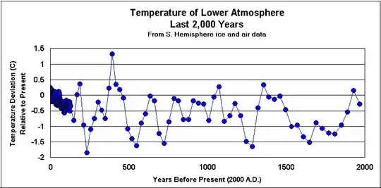
The first image is taken from Geocraft, a webpage which contains miscellaneous articles on geology-adjacent topics and, in particular, a section dedicated to the discrediting of anthropogenic climate change. The figure in question was ostensibly generated from a composite data set incorporating a historical $^{18}$O isotope record from the Vostok ice core taken from Eastern Antarctica and covering the period prior to 1871, southern hemisphere ground temperature data covering the period from 1871 to 1979, and satellite data covering the period from 1979 to the "present day" (though the page in question seems not to have been updated in the last 10-15 years).

I could find no references for the satellite data nor for the ground temperature data, so I have no means to reconstruct the plot myself. I can not explain why the time resolution appears to be $\sim 2$ data points per century, not can I say precisely how the data for the figure in question is calculated. Naïvely I would imagine that "Temperature deviation relative to present" means $T - T_{present}$ (whenever "present" is), but that would suggest that the final data point should be 0 (and of course, I have no idea what that temperature is meant to refer to - presumably some kind of average). Overall, the opacity of this data does not inspire confidence in the analysis and good-faith presentation, and so I personally do not find it the slightest bit compelling.


enter image description here

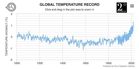
This data comes from the 2 Degrees Institute, an organization whose stated goal is to prevent the temperature anomaly displayed in the above figure from exceeding $2^\circ$ C. This figure was generated from a composite of proxy data (specifically, lake and ocean sediments and tree ring data) and the GISS Global Surface Temperature Analysis, which is based on land and sea meteorological measurements.

The answer to your question is provided by the GISS FAQ page:

Q. What are temperature anomalies (and why prefer them to absolute temperatures)?

A. Temperature anomalies indicate how much warmer or colder it is than normal for a particular place and time. For the GISS analysis, normal always means the average over the 30-year period 1951-1980 for that place and time of year. This base period is specific to GISS, not universal. But note that trends do not depend on the choice of the base period: If the absolute temperature at a specific location is 2 degrees higher than a year ago, so is the corresponding temperature anomaly, no matter what base period is selected, since the normal temperature used as base point (which is subtracted from the absolute temperature to get the anomaly) is the same for both years.

Note that regional mean anomalies (in particular global anomalies) are not computed from the current absolute mean and the 1951-80 mean for that region, but from station temperature anomalies. Finding absolute regional means encounters significant difficulties that create large uncertainties. This is why the GISS analysis deals with anomalies rather than absolute temperatures. For a more detailed discussion of that topic, please see "The Elusive Absolute Temperature".

If you are interested in reconstructing the GISS data yourself, all of the necessary resources (including the raw data files) can be found here. The data from the Nature paper can be found as supplementary data here.


I will leave it to you to decide which sources you find more compelling and for which reasons.

J. Murray
  • 69,036
  • I see, thanks. So is the claim that temperatures today are hotter than at any time in the last 2000 years (which is my interpretation of the second graph that you seem to accept)? I read that climate scientists claim that the rate is faster, not that the temperature itself is larger. – Pato Galmarini Jul 25 '23 at 03:36
  • @PatoGalmarini It is confusing, I agree. Climate science is very complex. To answer your question, based on the data reported and analyzed in the linked Nature paper, the global mean temperature anomaly (relative to 1951-80) is higher now than at any point in the past 2000 years, and is also increasing at an alarmingly high rate. It should be noted that the absolute temperatures are not being averaged over the surface of the Earth, but rather the temperature anomalies relative to the 1951-80 reference period [...] – J. Murray Jul 25 '23 at 03:47
  • [...] since it doesn't make much sense to average the temperature in Spain with the temperature in Antarctica. Also, it is of course important to mention that all temperature data prior to 1880 is a reconstruction based on various temperature proxies (as explained e.g. in the Nature paper) - however, the GISS surface data from 1880-present is comprised of direct temperature measurements from meteorological stations. – J. Murray Jul 25 '23 at 03:49